
Neon Revival: How Cold War Signs Are Fueling Retro-Modern Brand Aesthetics
Discover how Warsaw neon signs are shaping modern branding with palettes, motion recipes, and retro-modern visual systems.
Neon Revival: How Cold War Signs Are Fueling Retro-Modern Brand Aesthetics
Neon is back, but not in a simplistic throwback way. The new wave of Warsaw Neon Museum-inspired design is less about copying old signage and more about translating its emotional charge: gritty, handmade, optimistic, and unmistakably public. For creators, influencers, and publishers, this matters because the best neon aesthetics do something modern branding often struggles to achieve—they create instant atmosphere, a sense of place, and a memorable visual signature that works across social assets, motion design, and physical environments.
This guide breaks down how Cold War-era neon signs became a visual language worth revisiting, why their return fits the current appetite for nostalgic design, and how to turn that energy into brand systems that feel current rather than costume-like. We’ll cover practical color palettes, typography strategies, motion behaviors, content examples, and a production workflow you can use for campaigns, thumbnails, short-form video, packaging, and launch graphics. If you’ve been looking for a smarter way to use vintage signage without making your brand look dated, this is your blueprint.
Before we dive in, it helps to understand the broader trend: audiences are increasingly drawn to textures and signals that feel human, local, and imperfect. That is why visual directions rooted in old public signage, analog glow, and weathered materials keep resurfacing in branding, from editorial design to creator merch and live-event graphics. For a useful parallel, see how creators are already building distinctive systems in From Beta to Evergreen and Curating Maximalism, where visual identity is treated as a reusable asset, not a one-off campaign gimmick.
Why Warsaw’s Neon Revival Matters Now
Neon was never just decoration
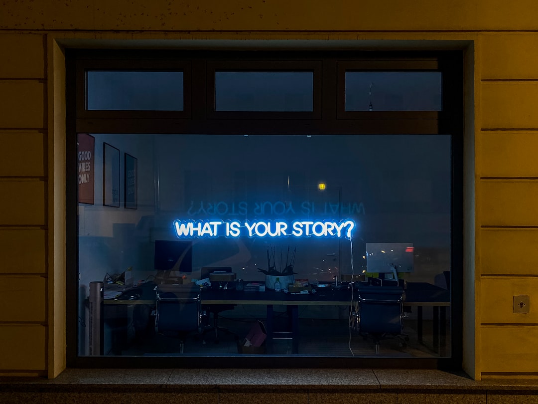
In Warsaw, neon signs were originally tied to postwar modernity, public messaging, and a belief—however constrained—that cities could still project brightness and possibility. That historical context is what gives the revival its power. These signs were functional, political, and emotional all at once, which makes them especially appealing to brands looking for a visual style that feels grounded in history but still alive on a screen. The appeal isn’t “retro” in the broad, vague sense; it’s specific, urban, and charged with contradiction.
The strongest modern brands often borrow from this kind of layered symbolism. They want graphics that communicate resilience, motion, and personality instead of generic polish. The resurgence of interest in the museum’s collections shows that audiences are responding to visual artifacts that feel salvaged rather than manufactured. That’s the same reason well-crafted creator systems perform so well in fragmented discovery environments, a theme explored in Directory Content for B2B Buyers and Optimize Your Product Listings for Conversational Shopping: when people see something curated and specific, trust rises.
The emotional mix: grit + hope
What makes Cold War neon so brandable is the emotional contradiction embedded in it. The signs are often physically worn, but visually luminous. Their edges may be rough, but the glow is unmistakably alive. That contrast is useful for modern brands because it solves a common problem: how to look premium without feeling sterile. A polished gradient on its own can feel empty; a neon tube with visible aging, texture, and halo feels inhabited.
This “grit but hope” formula is especially effective for creators in culture, music, nightlife, fashion, design, gaming, and editorial media. It gives you a way to speak to nostalgia without collapsing into kitsch. It also works in motion because glow, flicker, and haze are naturally kinetic. If you want a broader look at how audiences react to visual iteration and trust, the logic is similar to what’s discussed in Design Iteration and Community Trust and Creator Playbook: Which Webby Categories Translate to Real Revenue.
Why the trend feels fresh in 2026
Design trends often rebound when the cultural environment changes. As AI-generated imagery saturates feeds, audiences are becoming more sensitive to visuals that still imply craft, history, and locality. Neon signage satisfies that desire because it looks hand-built even when it’s digitally simulated. It also provides a better alternative to overused “future tech” aesthetics, which can feel cold or interchangeable.
Another reason the trend is rising: creators need thumb-stopping visuals that remain legible in feeds and motion-first environments. Neon’s high contrast, simplified letterforms, and glowing edge light work beautifully in small formats. That makes it ideal for reels, shorts, cover art, stream overlays, and launches. For teams trying to diversify their content stack, the same principle of reusable visual systems shows up in Curating the Right Content Stack and Product Announcement Playbook.
The Visual DNA of Cold War Neon
Shape language: curves, tubes, and readable geometry
Classic neon signage is not simply “glowy text.” It tends to be built from a few distinctive geometry types: rounded scripts, condensed block letters, simplified symbols, and shapes that can survive at a distance. That means the visual DNA is fundamentally readable. In brand design, this translates into choosing forms that can be recognized quickly in a scroll-stopping environment. If your logo or title treatment becomes too decorative, you lose the poster-like clarity that makes neon effective.
The best executions keep the original sign logic intact: a strong silhouette, a glow layer, and a surface texture. In motion design, that means letting letters illuminate sequentially, rather than appearing all at once. It also means giving the viewer a sense of electrical presence—buzz, flicker, bloom, or a subtle warm-up animation. If you’re building a visual system, think like a sign painter and a motion designer at once, much like the practical systems mindset in Model-driven incident playbooks and How to Build Real-Time Redirect Monitoring.
Material language: glass, rust, concrete, and night air
Neon signage gains much of its appeal from the surfaces around it. The glowing tube is only half the story; the rest is the environment—aged paint, concrete walls, wet pavement, cloudy glass, and the deep blue or black of evening. These context cues are what make the image feel cinematic. In branding, you can recreate this by pairing the glow with matte backgrounds, grain, and imperfect texture overlays.
Think in layers: one layer for the luminous element, one for the support structure, one for the environment, and one for micro-imperfections. Those imperfections matter because they keep the design from feeling like a generic “neon effect” template. They make the design believable. For brands that want to tell a richer story through place and process, this is similar to the logic behind Partnering with Local Makers and From Chain to Field, where the provenance of the object is part of the value.
The museum effect: archive energy as brand credibility
Part of the Warsaw Neon Museum’s power is that it turns signage into archive, not just decor. That shift matters because archives confer legitimacy. A visual reference becomes more persuasive when it is clearly rooted in documented history. Brands can borrow that strategy by building moodboards from actual artifacts, not just from trend galleries. The result is a more coherent brand story and less risk of aesthetic drift.
This is especially useful for brands that need to justify a retro-modern look to stakeholders. The museum framework gives you a cultural rationale: you’re not chasing nostalgia, you’re translating an era of public optimism and urban expression into modern formats. That’s a stronger brief than “make it neon.”
How to Translate Neon into Modern Branding
Start with a brand promise, not a glow effect
The biggest mistake in retro branding is starting with visuals before defining the emotional job the visual must do. If your brand promise is speed, nightlife, energy, or creative confidence, neon may be a fit. If your message is calm, clinical, or understated, the style may fight the product. In other words, neon is not the strategy; it is the expression.
To use it well, identify three adjectives that define your brand experience. For example: “electric, welcoming, late-night.” Then map each adjective to a design rule. Electric might mean saturated accent colors and pulsing motion. Welcoming might mean rounded type and warm bloom. Late-night might mean dark backgrounds and reflective surfaces. This sort of translation process is how good branding teams keep aesthetics from becoming arbitrary, a principle that also underpins How to Build the Internal Case to Replace Legacy Martech and Avoiding the Common Martech Procurement Mistake.
Build a palette with contrast, not just neon color
A strong neon palette isn’t only bright pink and cyan. The glow needs a supporting cast. Most successful retro-modern systems pair one or two vivid neon accents with dark neutrals, a muted midtone, and a highlight color that can be used sparingly. That structure creates hierarchy and keeps the design from becoming visually exhausting.
Here’s a practical palette framework you can adapt:
| Role | Example Color | Use Case | Why It Works |
|---|---|---|---|
| Primary glow | Electric magenta | Titles, CTA accents | Feels energetic and unmistakably neon |
| Secondary glow | Acid cyan | Motion trails, icons | Provides cool contrast and futuristic edge |
| Warm support | Amber orange | Secondary text, highlights | Recalls tungsten bulbs and old sign warmth |
| Anchor dark | Midnight navy | Backgrounds | Maximizes glow while staying less harsh than pure black |
| Texture neutral | Concrete gray | Panels, overlays | Echoes urban surfaces and keeps compositions grounded |
| Reserve white | Soft ivory | Body text, small UI details | Improves legibility without sterilizing the look |
One practical trick: use neon colors in small percentages. If everything glows, nothing glows. Reserve the brightest tones for focal points, and let the rest of the interface breathe. That balance is what makes the style feel premium rather than theme-park loud. For more on choosing useful visual cues instead of decorative clutter, the same discipline appears in High-Low Dressing and Best Home Tech Deals for Everyday Comfort.
Typography should feel sign-made, not retro-costume
Typography is where many neon-inspired brands lose credibility. They choose a font that looks like a diner sign or a 1980s arcade, and suddenly the whole identity feels like a prop. Better choices are fonts with sign-painter influence but modern spacing, clear counters, and strong small-size performance. Think of type as a structural base for the glow rather than a decorative object.
If you need a reliable formula, pair one expressive headline face with one highly readable sans serif for body copy. Keep the headline letterforms simple enough to remain legible under glow effects. In social posts, titles should be instantly understood on mobile, so avoid overly linked scripts unless the design is large-format. Brands that rely on conversion and retention should apply the same clarity-first thinking found in Cross-Engine Optimization and The AI Revolution in Marketing.
Visual Recipes: 5 Neon Brand Systems You Can Use
1) The Night Transit System
This version borrows from urban transport signage and station wayfinding. Use narrow condensed type, directional shapes, and a palette of cyan, red, and asphalt black. It works especially well for event brands, music channels, city guides, and creator newsletters. Motion should mimic passing trains or scrolling destination boards, with letters lighting sequentially and small iconography sliding in from the edge.
Best use cases include launch countdowns, sponsorship decks, and short-form teaser reels. If your audience values movement and urgency, this is a high-performance direction. You can also adapt the system into thumbnails and carousels where legibility and speed matter more than decoration.
2) The Museum Archive System
This system emphasizes authenticity, documentation, and texture. Use sepia-toned neutrals, electric blue accents, grain, and photographed surfaces like brick or concrete. Overlay date stamps, object labels, and subtle catalog-style typography. It’s ideal for brands that want to feel curated, editorial, or historically literate.
This is the closest fit to the Warsaw Neon Museum mood. It communicates that the aesthetic has provenance, not just style. It’s also a smart choice for culture publishers, design studios, and art-adjacent brands that need to appear knowledgeable without seeming precious. For businesses building credibility through curation, there’s useful context in analyst-supported directory content and Miniature Masterpieces.
3) The Midnight Diner System
Here the brand feels intimate, social, and just a little cinematic. Use warm reds, butter yellow, and dim teal against a near-black background. Add soft reflections, chrome details, and a hint of condensation or window haze. This direction is especially strong for hospitality, creator-led lifestyle brands, and food content with a nightlife edge.
The motion language should feel slow and inviting: a flicker from off to on, steam rising behind type, or a subtle glow pulse. It’s nostalgic without becoming parody because it focuses on atmosphere rather than surface references. For product storytelling in this zone, take cues from Running Events and The Gift-Giving Geography, both of which show how community and context shape perception.
4) The Future Relic System
This is the most contemporary interpretation. Combine neon tubing with clean digital UI, glassmorphism, and minimal layouts. Keep the palette restrained—one bright neon accent, one cool supporting color, and plenty of negative space. The result feels like a futuristic artifact from a better-designed city.
Use this system if your brand is tech-forward but wants warmth. It’s a natural fit for product launches, fintech explainers, AI tools, and creator dashboards. Motion can include subtle scan lines, light bloom, and modular transitions that feel engineered rather than flashy. If you’re building such an identity inside a modern stack, the same system-thinking shows up in Architecting a Post-Salesforce Martech Stack and E-commerce for High-Performance Apparel.
5) The Street Poster System
Use this when you want rebellion, immediacy, and creative edge. Mix hot pink, lime, paper white, and black with distressed textures and layered type. The aesthetic feels taped, pasted, or sprayed rather than pristine. This system works well for concerts, independent media, zines, and creator drops.
The key is not to over-polish the graphic. Let a little roughness survive the final output. In a feed dominated by smooth templates, rough edges can function like a signal of authenticity. That’s the same advantage many niche creators gain when they avoid overproduced sameness and instead lean into distinctive storytelling.
Motion Design: Making Neon Feel Alive on Screen
Animate the reveal, not just the object
Neon is fundamentally temporal because it turns on. That makes motion design one of the best ways to capture the aesthetic’s emotional power. Instead of simply placing static glow around a logo, create an ignition sequence. Start with darkness, then let the tube outline appear, brighten, flicker, stabilize, and bloom. That sequence creates anticipation and payoff in just a few frames.
For social assets, this kind of reveal can turn a simple title card into a memorable moment. Use the sign’s behavior as the storytelling device: buzz, warmth, pause, ignition. Even a 2-second motion loop can feel rich if the timing is right. Creators looking to build reusable motion systems can borrow similar repeatable logic from Productionizing Next-Gen Models and Which AI Agent Fits Your Studio?.
Use flicker sparingly and intentionally
Flicker is one of the easiest neon effects to overdo. Too much flickering reads as glitchy, old, or untrustworthy. The best practice is to use a short flicker only at the entry point, then let the sign settle into a steady glow. That mirrors reality: a real neon sign can stutter at ignition, but it doesn’t usually shake forever.
In motion systems, pair flicker with atmospheric movement: drifting grain, slight camera sway, or soft haze. These make the scene feel physical without distracting from the message. If you’re working with creators or teams who need safe, repeatable motion workflows, the same operational discipline appears in Managing Operational Risk When AI Agents Run Customer-Facing Workflows and Agent Permissions as Flags.
Design for loops, not just exports
Neon works beautifully in seamless loops because the viewer can re-enter the motion at any point. This is especially useful for social banners, story backgrounds, and live event screens. Design a loop with a beginning, middle, and end that can recycle without a visual jump. If the glow intensifies, fades, and returns to its starting state, the motion becomes meditative rather than repetitive.
Loop thinking is also useful when building branded motion libraries. One sign reveal can generate multiple assets: a post cover, a teaser, an intro sting, a lower third, and a closing bumper. That efficiency matters for creators and publishers trying to scale production without flattening style. The same asset-reuse mindset appears in From Factory Floor to Stream Deck and How Research Brands Can Use Live Video.
Practical Workflow: From Inspiration to Brand Kit
Step 1: Build a source board from real signage
Do not begin with abstract “neon inspiration” images. Start with photographs of real signs, wall textures, nighttime streets, and archival examples from places like the Warsaw collection. Look for repeated details: tube thickness, letter spacing, mounting hardware, color interactions, and how light blooms in bad weather. Those details are what make the eventual brand system feel rooted rather than generic.
As you assemble the board, annotate what each object is doing emotionally. Is the sign welcoming, defiant, romantic, or civic? Is the glow clean or slightly unstable? This qualitative layer is what transforms a moodboard into a usable creative brief. For teams handling lots of visual inputs, the principle resembles the discipline in How Market Research Teams Can Use OCR and Building De-Identified Research Pipelines, where raw material needs structure before analysis.
Step 2: Define the system components
Every neon-inspired identity should specify a small set of repeatable pieces: headline treatment, accent color logic, texture style, motion behavior, icon set, and background rules. If you can’t explain the system in a short checklist, it’s probably too loose. The point is not to make every asset identical; it’s to make every asset recognizable as part of the same world.
Document how much glow is allowed, which colors are reserved for CTA moments, and what textures are always present. This protects the brand from becoming visual spam. It also makes collaboration easier across designers, social managers, and motion editors.
Step 3: Create production templates for social and motion
Once the system is defined, turn it into templates that can be used across formats: Instagram stories, TikTok covers, YouTube thumbnails, newsletter headers, presentation openers, and event screens. Build in safe zones for copy, especially because neon aesthetics often rely on large type that can clash with platform UI. Keep the templates modular so the same frame can support different campaign messages.
For motion, establish a small library of repeatable effects: light-up, buzz-on, slow pulse, color shift, and reflection sweep. These become your branded vocabulary. If your audience is likely to see multiple posts in sequence, consistency will do more for recall than novelty. That’s similar to how smart commerce content benefits from first-order savings and how launch strategy benefits from last-chance deal alerts: the pattern needs to be clear and repeatable.
Common Mistakes to Avoid
Over-saturating everything
Not every object should glow. If your backgrounds, icons, text, and borders all compete for attention, the composition loses hierarchy. In the most effective neon systems, the brightest elements are special because they are limited. Use dark space as a design asset, not an empty area to be filled.
A good rule: if you can read the whole screen instantly, but your eye still has a place to land, you’ve balanced the palette correctly. If the screen vibrates visually, simplify. This restraint is what turns a trend into a brand asset.
Using cliché retro references without context
Arcade fonts, 80s gradients, and stock lens flares can be useful, but they can also collapse a design into nostalgia shorthand. The Warsaw-inspired direction works better when it feels civic and lived-in. Bring in real-world surfaces, documentary references, and a clear brand purpose. That’s how the style feels contemporary rather than costume-driven.
In practice, this means choosing one or two retro cues and surrounding them with modern structure. Clean layout grids, digital responsiveness, and accessible typography keep the identity useful. You want the audience to feel history, not be trapped in it.
Ignoring accessibility and legibility
Glow can harm readability if contrast isn’t managed carefully. Always test small-size text, low-light screenshots, and mobile views. Neon styles are especially vulnerable to over-blur, which can make text look decorative but unusable. Make sure body copy remains crisp and that the color palette supports accessibility for all major placements.
Accessibility is not a compromise to the aesthetic; it is part of the professional finish. If you want a brand system that lasts across campaigns and platforms, clarity will outperform cleverness most of the time. The best creators know that visual identity must work in the wild, not just in a portfolio mockup.
When to Use Neon Aesthetics in Branding
Best-fit categories
Neon works especially well for nightlife, music, fashion drops, cultural institutions, streetwear, creator media, city guides, experiential events, and products that benefit from a strong sense of mood. It also performs well when the brand needs to feel nocturnal, energetic, or socially magnetic. If your audience lives on mobile and responds to visually rich storytelling, the style can be powerful.
It can also elevate brands that need to stand apart in crowded discovery channels. In these cases, visual distinctiveness becomes a business asset, not just an artistic choice. That’s one reason why curated, recognizable visual systems tend to outperform generic templates in creator ecosystems.
Cases where it may not fit
Neon is usually a poor fit for brands selling calm, trust, medical precision, heritage restraint, or minimalist luxury. It can work in some of those categories as an accent, but not as the core identity. The same glow that creates excitement can also create noise. Good branding is about choosing the emotional temperature that best matches the offer.
When in doubt, test neon as a campaign layer first rather than as a full rebrand. If it improves engagement and message retention without damaging trust, you’ve found your lane. If it overwhelms the product, step back and use only selective cues.
Conclusion: The Future of Retro-Modern Branding Is Emotional, Not Ironic
The most interesting thing about the neon revival is that it isn’t really about the past. It’s about how the past can help brands feel more human in the present. The Warsaw Neon Museum shows that signs once tied to political systems and urban infrastructure can outlive their original context and become symbols of resilience, memory, and public imagination. That’s exactly why they resonate now: they carry history without freezing it.
For creators and publishers, the opportunity is to use that energy with discipline. Build palettes with contrast. Use texture to ground the glow. Let motion reveal the sign rather than simply applying effects. And, most importantly, keep the emotional logic intact: neon should feel like a promise in the dark, not just a style preset. If you treat it that way, you’ll create brand assets that look nostalgic, but more importantly, feel current.
If you’re extending this kind of visual thinking into a broader brand system, it can also be useful to study how curation, discoverability, and trust are built in adjacent formats. Explore Operational Security & Compliance, Warsaw Neon Museum, and Best Portable Coolers and Power Stations for different examples of how specificity and utility shape audience trust in visual and commercial systems.
Pro Tip: The fastest way to make neon feel modern is to pair one vivid glow color with a strict grid, generous negative space, and motion that turns on like a real sign. Atmosphere sells; clutter doesn’t.
FAQ
What makes neon aesthetics different from generic retro branding?
Neon aesthetics are defined by illumination, contrast, and atmospheric depth. Generic retro branding often relies on nostalgia cues like old fonts or faded textures, but neon adds a physical feeling of light and space. That gives the design more emotional range and stronger performance in motion.
How do I choose the right color palette for a neon-inspired brand?
Start with one primary glow color, one secondary accent, one dark anchor, and one neutral support tone. The palette should create strong contrast while leaving room for text readability. Avoid using too many neon shades at once, because the effect becomes noisy rather than luminous.
Can neon branding work for a serious or premium business?
Yes, but usually as an accent rather than the entire identity. The key is to combine the glow with restrained typography, a disciplined layout grid, and minimal texture. That way the design feels elevated instead of playful or gimmicky.
How do I make neon visuals work on social media?
Design for mobile first. Use large type, limited copy, and strong contrast so the image reads instantly in a feed. Motion helps a lot: a flicker-on reveal or soft pulse can make a simple post feel cinematic and memorable.
What’s the biggest mistake brands make with vintage signage inspiration?
The biggest mistake is treating old signage as a costume. If you copy the surface look without understanding the original purpose, the result can feel fake. Better to study real signs, extract the principles, and then re-build them around your modern brand story.
How can small creators use this style without hiring a large design team?
Build a compact system: one palette, one headline font, one texture pack, and one motion template. Then reuse it across posts, covers, and stories. Consistency will do more for recognition than a constantly changing visual style.
Related Reading
- From Beta to Evergreen: Repurposing Early Access Content into Long-Term Assets - Learn how to turn short-lived creative work into durable brand value.
- Design Iteration and Community Trust: Lessons from Overwatch’s Anran Redesign - See how thoughtful changes can improve audience confidence.
- Curating the Right Content Stack for a One-Person Marketing Team - Build a lean system for producing consistent creative output.
- Product Announcement Playbook: What Marketers Should Do the Day Apple Unveils a New iPhone or iPad - Plan launch visuals that hit hard at the right moment.
- Curating Maximalism: How to Build a Pop-Forward Art Collection for Lifestyle Shoots - Use bold visual layering without losing editorial polish.
Related Topics
Elena Marlowe
Senior SEO Content Strategist
Senior editor and content strategist. Writing about technology, design, and the future of digital media. Follow along for deep dives into the industry's moving parts.
Up Next
More stories handpicked for you

Host a Clay & Code Salon: A Blueprint for Cross-Disciplinary Creative Events

Curatorial Practice in Live Performances: Lessons from Recent Concerts

From Wheel to Wireframe: What Pottery Teaches Us About Ethical AI for Creatives

Parade-Worthy DIY: Creating Costume and Prop Asset Kits for Creators and Influencers
Romantic Narratives in Art: Why Emotion Matters
From Our Network
Trending stories across our publication group

Designing Interactive Product Timelines: What Creators Can Learn from the iPhone Archive

Finish First: Designing Reproducible Prints — A Creator’s Checklist

Navigating AI in Photography: Should You Block Crawlers?

Portraiture as Narrative Asset: How to Commission Images that Reveal Contradiction (Lessons from Jan Morris)

From Auction Floors to Asset Libraries: Curating Artist Editions that Scale
